From JSON to visualization: Analysis and process guidance for OCDS data

This post in our technical series explores a particular trend around the use and analysis of OCDS data, along with our reflections from analyzing OCDS data published by the UK’s Crown Commercial Service (CCS).
Our work at the OCDS Helpdesk has often focused on supporting OCDS standard implementation, development and governance. However, we recently started to explore ways of analyzing OCDS data to better understand what sort of insights it can provide. This decision was largely influenced by our partners, who have shown an increasing interest in not only publishing contracting data in OCDS-conformant JSON format but also understanding what insights they can gain from analyzing this data.
Analyzing JSON data
The JSON file format was chosen as the primary serialization for OCDS because it can easily express the one-to-many relationships between the contracting data elements (e.g. a tender notice may have many awards, a contract may have many milestones). It does so more succinctly and simply than XML, which is another popular file format for data standards.
However, despite being an appropriate format for storing and sharing contracting data, JSON is not a format that is commonly supported by data analysis tools. Many popular tools, including the vast number of SQL-based tools, expect tabular data in order to perform data analysis.
In this blog post, we’ll provide an example of how OCDS data in JSON format can be converted to tabular format to enable SQL-based querying and data visualizations to be used.
We will use a recent experience working with data from CCS in the UK to describe the process.
From JSON to BigQuery
The first step in this process was to retrieve JSON format OCDS data from Contracts Finder through the Contracts Finder API. For the purpose of this exercise, we used their OCDS Release API to capture all releases, which reflect the full history of changes for the contracting processes (for more on releases and records click here). The API responses were stored as JSON files.
The JSON files were then loaded into Google BigQuery, which is a cloud-based data warehouse used for data analytics. It can be accessed through a web UI or a command-line tool, and for our data exploration exercise we chose the former.
Although BigQuery is not the only data store that allows the users to run SQL queries, it is based on a columnar storage that supports semistructured data. This works great for OCDS data, which, being in a structured JSON format, has a variety of arrays (e.g. awards, parties etc.) that BigQuery can handle with ease.
Beware of arrays!
As mentioned above, OCDS data contains a multitude of arrays, so if any particular field from an array has to be used in a query, that particular array has to be flattened in order to allow for the query to run successfully (more on arrays in BigQuery here).
Here’s a sample query where the awards array is being flattened/unnested:
SELECT
ocid,
tender.value.amount AS tenderAmount,
tender.value.currency AS tenderCurrency,
awards.value.amount AS awardAmount,
awards.value.currency AS awardCurrency,
awards.date AS awardDate
FROM
`ocds-172716.new_releases.uk`
LEFT JOIN
UNNEST(awards) AS awards
ORDER BY
tender.value.amount DESC
LIMIT 10
In order to visually demonstrate how arrays are unnested in BigQuery, the following representation might be helpful:
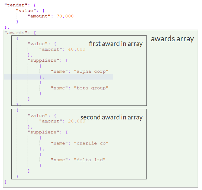
The diagram above shows a snippet of an OCDS JSON file that contains data on a single tender (of value 70,000) that resulted in two awards – one for 40,000 and the other for 20,000. Each of the two awards was also split between two suppliers – 40,000 between alpha corp and beta group; 20,000 between charlie co and delta ltd.
The table below shows how this data is flattened into a BigQuery structure after unnesting the awards and suppliers arrays:
| tender.value.amount | awards.value.amount | suppliers.name |
| 70,000 | 40,000 | alpha corp |
| 70,000 | 40,000 | beta group |
| 70,000 | 20,000 | charlie co |
| 70,000 | 20,000 | delta ltd |
If we then want to write a query to find out the total value of tenders and awards for this buyer, some of these values would be double counted – i.e. the total tender value based on the table above would be 280,000 (instead of 70,000, which is the right value) and the total awards value would be 120,000 (instead of 60,000, which is the right value).
Therefore, the main thing to be aware of when analyzing OCDS data in BigQuery is that if you are unnesting arrays and then adding up the values, then you might end up double counting some values.
One possible way to avoid double counting is to create separate “helper” tables for those objects that are arrays in the OCDS JSON data, e.g. a “helper” table for awards, for contracts etc. That way the issue of double counting would not be as relevant, but certain queries might become more complex by having to join tables.
After exploring the data in BigQuery, the dataset was linked up to Data Studio to help further analyze it through a range of visualizations.
Exploring OCDS data in Data Studio
Data Studio is an online platform created by Google that enables users to visualize data through dynamic reports and dashboards. One of its key benefits is its ease of use, as it allows users to drag-and-drop and create data visualizations in just a few clicks.
Data Studio is also easy to connect to a variety of data sources, including existing BigQuery tables or datasets created by custom queries.
In order to explore some basic functionalities of Data Studio, a few sample questions were put together to illustrate the process of visualizing OCDS data.
These questions and the visualizations produced are shown below:
Which buyers have the most contracting processes (Count Distinct ocid)? How many OCDS releases are published for those contracting processes (Count Distinct id)?
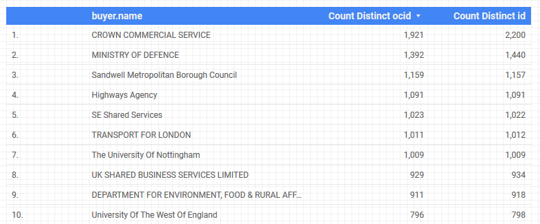
The table above shows that Crown Commercial Service publishes information on the most contracting processes, followed by Ministry of Defence and so on. Also to clarify, having a higher number of OCDS releases compared to the corresponding number of contracting processes simply indicates that there are multiple releases of information, or updates, for some of the same contracting processes published.
What percentage of the total amount awarded by all buyers corresponds to each buyer?
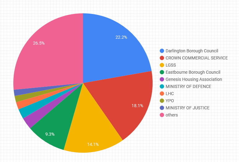
The pie chart above demonstrates that Darlington Borough Council has awarded the most for contracts, according to the OCDS data published on Contracts Finder. This is an interesting insight as it might be somewhat unexpected to see a local borough council at the top of this ranking.
How many tenders and awards were published per buyer? (top 10 buyers based on highest tenderCount)
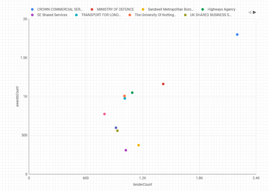
The scatterplot above shows the relationship between the number of tenders and the number of awards published by the top 10 buyers (where top 10 buyers are selected based on the highest number of tenders published).
It’s interesting to note that the overall trend for the buyers on the scatterplot is to publish more tenders than awards, even though in some cases the numbers are quite close.
OCDS encourages equal disclosure of information across all stages of the contracting process, so we recommend that the awards information is published for all tenders, where that is available.
Conclusions
Here are our main takeaways:
- Pay close attention to arrays in OCDS data and make sure to flatten them in your SQL queries.
- Beware of double counting when querying flattened arrays and consider using “helper” tables to help avoid double counting.
- Choose an approach and tools that you feel comfortable with and you think are appropriate to analyze OCDS data, as the process described above only demonstrates one way in which this can be done.
Process reflections
In summary, the process of retrieving OCDS data from an API, loading it into BigQuery and linking it up to Data Studio was fairly straightforward, yet it could be further optimized by, for example, improving the scraper scripts and the tooling for loading OCDS data into BigQuery.
This was a run through of what an end-to-end workflow could look like for retrieving, analyzing and visualizing OCDS data.
Let us know when you explore the scripts and data visualizations mentioned above, and share with us any suggestions to improve them! We hope that the reflections shared here will be of value and help to better understand how to use OCDS data.