Showing where taxpayers’ money goes: some guidelines on procurement data visualization

The European procurement market is a huge beast. In 2017, the total value of public purchases of goods and services across the European Union was estimated to be a whopping €2 trillion (or about 13% of GDP). Although the EU took significant steps in 2016 to open up the procurement market, it still recognizes that a lot of work remains to be done to level the playing field so that small and medium-sized enterprises (SMEs) can compete with big business for tenders in a fair and transparent fashion.
This transparency principle, a key element of a good democracy, demands that data related to taxpayers’ money should be as open as possible. Open data is good for everyone: only an economy that is open and fair can provide opportunities for new and small businesses. This is incredibly important as the best innovations often start small! Being life-long transparency advocates ourselves, we align with the OCP’s mission ‘to use the power of open data to save governments money and time and deliver better goods and services for citizens’. This is a big job which requires tackling the issue from multiple angles.
One way of bringing some well-needed transparency into the procurement market is to visualize who is doing what, when and how: where do public funds go and how are stakeholders connected? How have these networks evolved over time? Presenting this data in a concise manner is not just a way to uncover unrealized business opportunities but also helps detect patterns of collusion and corruption. Data visualization is a fantastic approach to make sense of data and to provide better insight into the complex world of procurement. But no one size fits all and for practitioners who work in the fields of open data, procurement and transparency it is important to sift through the good, the bad and the ugly.
So what are the principles of a good data visualization strategy? Here are some basics that any open data advocate and procurement professional should consider:
Be clear about what you want to communicate
If you work in the area of procurement, you’re likely to sit on tons of heterogeneous datasets. Your data is probably numerical (e.g. tender volume), related to time or categorical (e.g. sector of spending), and spatial (e.g. geographical coordinates). Not all of this data will be equally important for all of your stakeholders to see. And not all of your data will require visualization. The first step in getting your visualization strategy right is to think carefully about what users will want to see and what insight you wish to get across in the most efficient way.
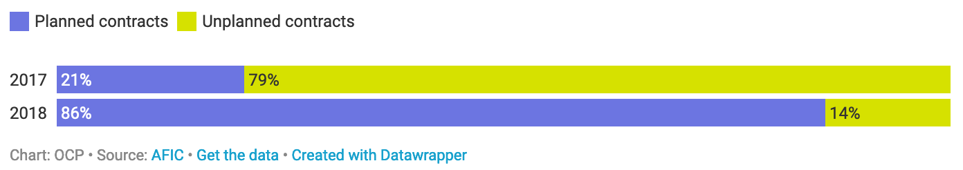
Once you’ve worked out what data you want your stakeholders to consume, you should think of some appropriate analyses, statistics, indicators and aggregates that best summarize and communicate your data. You may wish to provide intel on how information about contract dates, volumes, etc. has evolved over time, or present a comparison between bidders and suppliers, or evaluate some KPIs, or show how data is geographically distributed. We recommend thinking about this carefully at the design stage. And consider how these variables hang together. A good data visualization strategy is clear about what it wants to achieve. Here are some examples of how a simple and clear message could be communicated visually:
Think about every element of your visualization design – it matters
Data visualizations are designed to make it easy to compare data or tell a story – both of which can help users to understand a topic and make decisions (the Trifecta checkup provides a general framework to evaluate if the visualization works). This includes selecting a chart type that fits your data and the message you want to convey with and about your data. You will want to think about the graphical elements, who would see it and where (e.g. on a desktop browser or on small screens, such as a mobile device). But you will also need to think about the type of font you use, if you use icons or not, the colour choices and if they are readable but also if they convey a message. You should consider the axes and scales you use in the chart and how to label them. The issue of legends and annotations and whether people can actually read and make sense of what you created is important too. As is thinking about whether your users could face constraints, such as physical ones (e.g. colour blindness) or in terms of skills (e.g. avoid technical terms) or of bandwidth and screen size (e.g. avoid large charts that require scrolling or interactive visualizations that don’t convey the message when it does not load fast enough).
Avoid chart junk
Chart junk describes all visual elements in charts and graphs that are not necessary to comprehend the information on the graph, or that will otherwise distract the viewer from this information. This means avoiding graphical excesses that don’t ‘respect’ the data and the audience. The visual layout should help to deliver the message and should contain the minimum amount of elements on a chart necessary to achieve this. So when you have chosen the data, the message and a chart type, review the visualization and see if you can reduce unnecessary lines, background images or elements. You can use custom styles and shapes to make data easier to understand at a glance, in ways that suit users’ needs and context. Explain your charts, bars and indicators well, e.g. by labelling your axes clearly and to the right amount of detail – for instance by providing units of measurement. Think about the language your audience is most likely to understand and don’t forget that communicating things as easily as possible includes the largest range of users to consume your content. Avoiding unnecessary complex words is also a way to reduce chart junk.
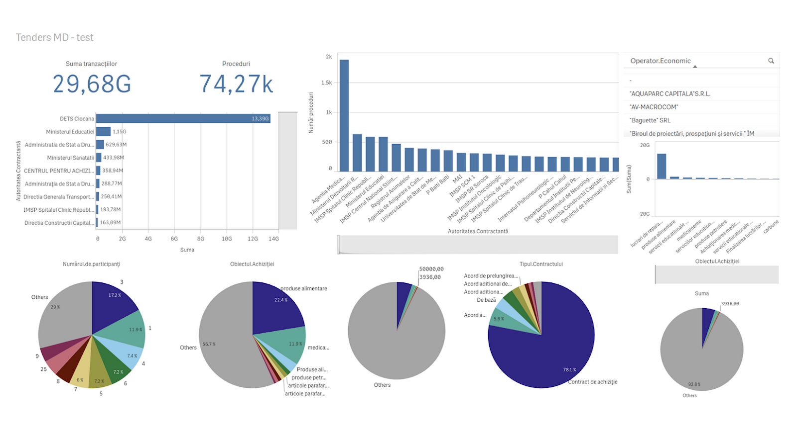
Design a dashboard if your story is more complex
If you want to display a series of multiple charts you can design a dashboard. As we said before, you should keep your visualization as simple as possible. That’s why separate but connected charts can sometimes better tell a story than one complex chart. Dashboards are often used to monitor changes in data (for more guidance on dashboard design, see Stephen Few’s Information Dashboard Design). A good dashboard can contain different types of charts, such as bars, time series or indicators presented in an aesthetically pleasing way that strikes the right balance between keeping things tidy and simple but providing valuable insight (see https://datavizproject.com/ for an overview of the data visualizations commonly used for this purpose).
This means on a dashboard you’ll need to arrange your content in a meaningful and effective way. Prioritize the most important information using layout structures. Research that tracks how users navigate on a website has revealed that people associate different levels of relevance and importance depending on where content is located on a page. Users tend to pay more attention to the top-left and centre sections of a screen; your most important visualizations should go here. Material in the bottom-right corner, however, is often considered less relevant. Also make sure that items that are logically close to one another are in proximity on display too, e.g. avoid spreading spatial data all across the screen.
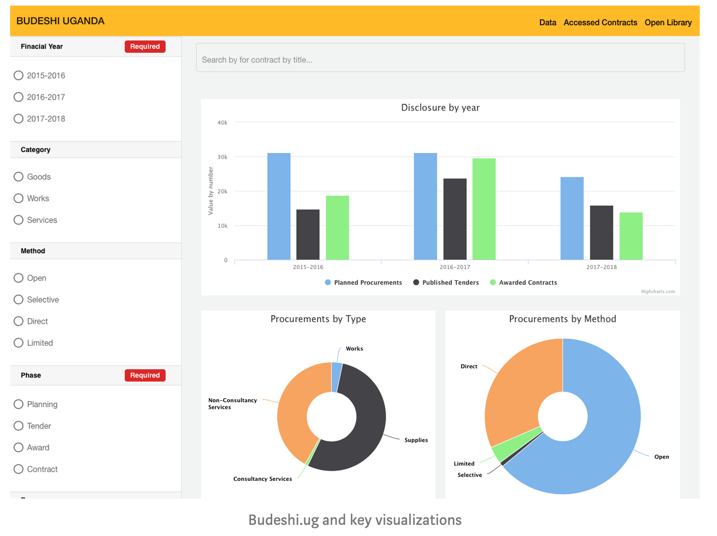
Here are some examples of dashboards for procurement data:
A lot more can be said about data visualization and we have compiled more detailed guidelines under https://theybuyforyou.eu/visualizationtool/guideline.html. In the next post we’ll provide an overview of the TheyBuyForYou tool that we’ve been working on as an example of how we have taken these guidelines to heart when working with procurement data.
Elena Simperl is Professor of Computer Science at King’s College London. She leads several projects on TheyBuyForYou, an EU-funded research consortium where she and her team built a cross-European knowledge graph of procurement data alongside a series of interfaces and tools that enable SMEs to realize new procurement opportunities. Elena is also the Principal Investigator of the Data Stories project that develops novel ways for citizens to engage with data in a post-truth society.
Laura Koesten is a researcher at King’s College London. She was a Marie Curie Skłodowska fellow at the Open Data Institute and at the University of Southampton, UK investigating the user perspective in dataset search. She is part of the TheyBuyForYou and the Data Stories project. In her research she is looking at ways to improve Human Data Interaction by studying sensemaking with data, data reuse and collaboration and human factors in data science.