A network map of the Open Contracting Partnership
At the Open Contracting Partnership we have the ambitious goal of leading a shift in norms and practices in government contracting: from closed to open. In order to make that happen, we need to break through silos and work with a lot of other leaders.
By mining organizational email, we used metadata to chart engagements, revealing where a year of advocacy and implementation had been invested. We were inspired by hands-on network mapping efforts led by Root Change, PACT, and others. But before reaching out to our network in a «high-touch» way, having a sense of what we needed and where we were was critical. To get a baseline map of the full staff’s network, we reworked MIT Media Lab’s Immersion tool and Graphistry. The solution we have arrived at is passive and evidence-based.
We plan to nest these insights into a new network engagement strategy co-created with innovators representing the truly cross-cutting nature of this field. It is a process we are just beginning, and we are excited to explore the first results with you.
Our analysis surfaced 16-18 communities (with about 600 people total), connected to our work; 6 of those communities are especially active. In the coming months, we plan to connect the email baseline and targeted consultations with partners, identifying missing actors that should be included but have been missed so far. We see this email-based technique as quick way to get ourselves oriented with our emergent network. This output frames a conversation that will be feeding into a more complex network strategy co-creation process. In the meantime, we can already start utilizing the insights from the 2015 map to support 2016 decisions.
Getting started
In developing a network baseline map, we focused on three questions:
- Are we effectively building up the network to move the idea and practice of open contracting past a tipping point?
- Who needs to be engaged for that to happen?
- Where are we now?
Our anchor for answering those questions was this theory: Community + Community + Community (…) x Open Contracting = Norm Shift
The concept is that as groups of people (governments, issue advocates in civil society, technologists, industries) begin using and advocating for open contracting, we will eventually have a world where open contracting has become the new normal.
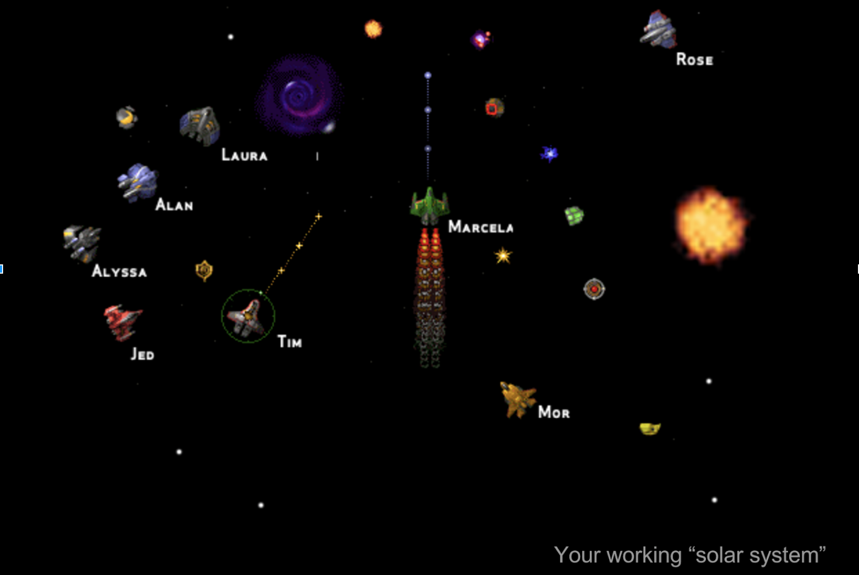
The solar system and the galaxy
We decided to start running with that theory and exploring these questions by looking at our organizational emails. Why? Because the emails from our team create a clear trail of our work and collaborations on the macro scale. They are broadly reflective of actual organizing effort, a record that goes beyond anecdotes. We also knew that this data could eventually be linked or compared with other data already on hand, such as social media analytics, CRM data, or even event sign-ins.
Communities are composed of people we work with on an everyday basis. You know you collaborate with certain people on certain topics more often than others. But if you think about everyone that your entire organization works with, it can be a challenge to accurately describe where you are putting your collaborative energy exactly. What this mapping process gave us was a very candid snapshot of those people and the communities of collaboration that have developed over our first year.
You’ll notice that we aren’t in the picture ourselves. The email analysis reveals the “solar system” layout of organizational contacts. Some starships tend to stay close together. Others are more dynamic, shutting information around space. For strong advocacy impact, you want the right balance between close allies and friends who can get to the furthest reaches of the galaxy.
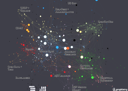
The OCP’s network baseline map
As mentioned before, this network map builds off of demonstrated successes of MIT Media Lab’s Immersion project, but we expanded the concept to show our entire organization’s email networks of introductions and cc’s.
The analytics underlying the Immersion system were incredibly valuable—they identified all the communities, linkages and positions of contacts. But with metadata from 30,000 emails and all our staff, we needed a platform that could visualize the results those algorithms more effectively. This was possible through Graphistry, which is a groundbreaking graph analysis startup. With Graphistry, we were able to make more progress, linking the immersion data with data we had from our CRM as well as our list of team-identified leaders in the open contracting field, known as “key influencers.”
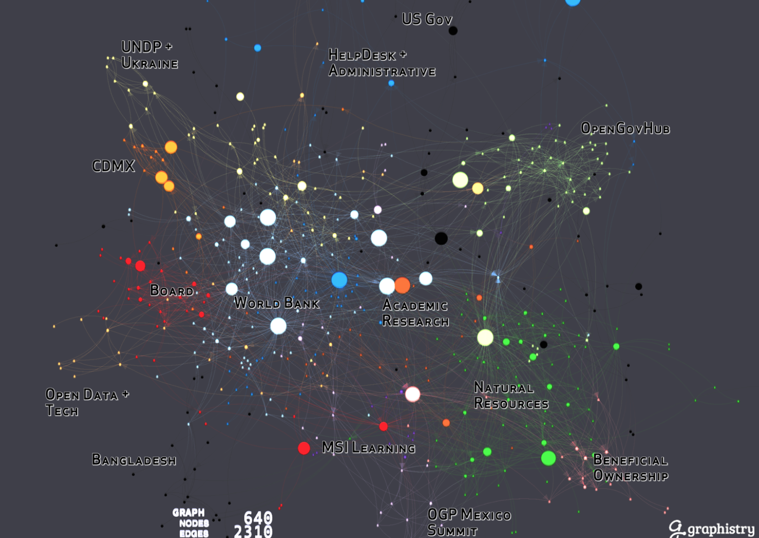
The bubbles, which we like to think of as starships, are sized by their “closeness” to the OCP in this map: back-and-forth email exchange. Lines show conversations of emails, while colors indicate algorithmically detected subnetworks (known formally as “communities”). As people collaborate more widely in the network, they move toward the center. It may be interesting to note that this is a horizontal network, with no one staff person’s contribution ranked arbitrarily above another’s.
Our internal version goes a bit further, with each dot representing an individual contact. Each one can be clicked on to see more detailed information about how we work together with them.
Takeaways
Getting a sense of the galaxy beyond the OCP solar system builds upon this learning.
Right now, we’re discussing three options:
- Enrich key advocates lists internally with map
Attach more complete tables of information like key advocacy contacts to the existing network map. These allow us to filter or redraw the map for particular contexts that highlight strong collaborators who aren’t already included in those lists. - Contextualize in a twitter map
Take network data from the @OpenContracting Twitter follower network and superimpose it into the current email network. This expands our perspective from our local solar system, but is still grounded firmly. - Contextualize in a survey/co-created map
Pursue hands-on survey or workshop-based network and resource mapping. Use the map to convene the core implementers, advocates and funders to collaboratively map the field of open contracting, surface lessons about what has worked or not, and identify gaps in activity or support needs. - Relationship Feedback dashboard
As we go forward on any of the points above, we will need to track our progress on a more granular level. For that, we’ve done some proof-of-concept experimentation with a relationship dashboard called Zendoscope created by Marc Maxmeister.
Because of our commitment to experimentation, we were able to explore new techniques for developing organizational learning. In terms of initial results, we’re thinking more now about where we’re putting our (limited) collaborative energy as a team. We now have a great framework for strategic conversations, and as we run the analysis again and again, we’ll be able to monitor the impacts of our adapted outreach and engagement approaches.
This is all to say that we felt this was a pretty cool process and we think other advocacy organizations might benefit from trying it too.